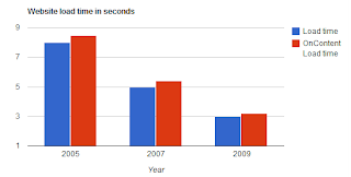
There are 200million web sits (and growing!) as I write this blog. Everyday a new device using the OpenSource Android platform is getting released... Tablets, laptops, Smartphones and the good old desktop are all being used by consumers, each running a different browser and an Operating System. Till two years ago, there were only 2 browsers and now we have 4 serious contenders jostling for space. Your site has to work on every combination mentioned above! Here are some specifics about how a web site experience is perceived on various devices:
- Users expect the sites to load as fast on mobile phones as they would on Laptops and Desktops
- Users expect the site to format the data automatically to fit the size of the screen on their device
- Users who have a bad experience visiting a site on their mobile device tend to not visit the site afterwards
In addition, search engines are continuously tweaking their Ranking algorithms so as to ensure a fair playing field. SEO (Search Engine Optimization) a field that has taken a life of its own now is a thriving business as sites try to rise above the noise to rank high on searches (remember there are at least 200million web sites now!).
The graph above was created using Google Visualization Chart and the Google script does not work on this blog; if you want to see how it works, click here.

No comments:
Post a Comment