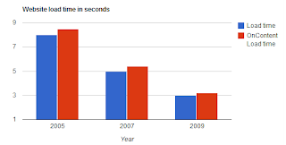
 Google continues to release an impressive library of rich API tools that can be used by developers to create charts, gadgets that are easy to implement and are portable. In this post we create a simple guage that shows the effects of more users on the Server throughput. Clicking on More users or Less users shows the effect on the Server throughput, typically measured in requests per second. Click here for a demo of the same!
The sample code was well structured and easy to incorporate into my page, although there are a few hiccups (such as not showing up correctly on an iPhone or an iPad), but this beats the alternative of writing your own script. What is more impressive, is that these calls are very fast! You can change the Google sample code interactively by going to their site at:
http://code.google.com/apis/ajax/playground/?type=visualization#gauge_interaction.
